
Filmmaker, author, screenwriter and founder of Twisted50. Currently directing splinter unit on Mission: Impossible 8.

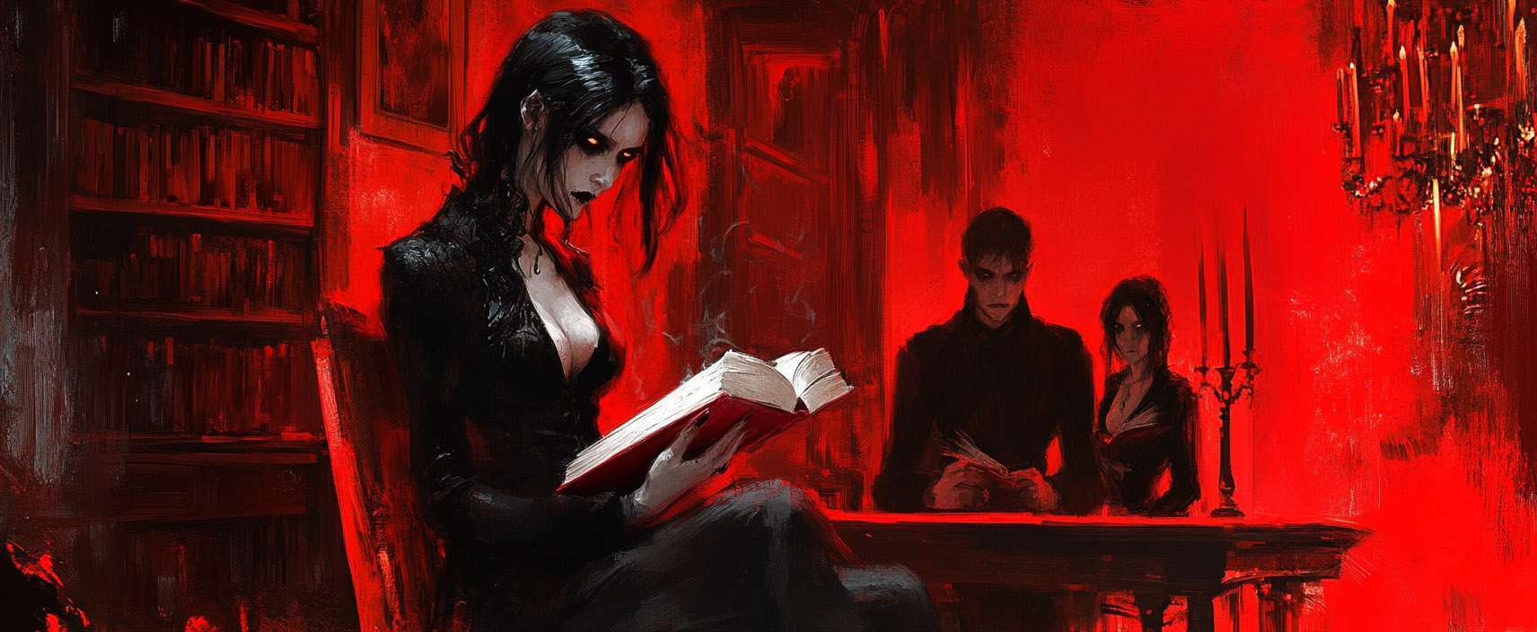
It’s time for you to help me design the BEST cover for Twisted50 vol III. Which of these four jumps out at you most? Please vote and also leave a comment below too. NOTE The voting system is glitching and yes I know about the typo in Demented now (thank you), so please leave comments below for your vote.
Thanks CJ
And don’t forget to come back and leave a comment below.
Filmmaker, author, screenwriter and founder of Twisted50. Currently directing splinter unit on Mission: Impossible 8.
| Cookie | Duration | Description |
|---|---|---|
| cookielawinfo-checkbox-analytics | 11 months | This cookie is set by GDPR Cookie Consent plugin. The cookie is used to store the user consent for the cookies in the category "Analytics". |
| cookielawinfo-checkbox-functional | 11 months | The cookie is set by GDPR cookie consent to record the user consent for the cookies in the category "Functional". |
| cookielawinfo-checkbox-necessary | 11 months | This cookie is set by GDPR Cookie Consent plugin. The cookies is used to store the user consent for the cookies in the category "Necessary". |
| cookielawinfo-checkbox-others | 11 months | This cookie is set by GDPR Cookie Consent plugin. The cookie is used to store the user consent for the cookies in the category "Other. |
| cookielawinfo-checkbox-performance | 11 months | This cookie is set by GDPR Cookie Consent plugin. The cookie is used to store the user consent for the cookies in the category "Performance". |
| viewed_cookie_policy | 11 months | The cookie is set by the GDPR Cookie Consent plugin and is used to store whether or not user has consented to the use of cookies. It does not store any personal data. |
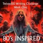
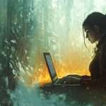
35 thoughts on “Twisted50 vol III… Which Book Cover Do YOU Like Most? And Why?”
I accidentally voted for 1 but wanted to vote for 4, apologies!
Number 4 looks us straight in the eye and smacks us in the face.
It really stood out to me.
Has to be the clown, surely? It stands out and means business.
Number 4 sure gives out the right vibes for the book. She’s scarier than the death surrounding her.
As a writer I like the ones with the girl reading , because that’s how I imagine a reader to feel . As an observer I voted for the clown because the colours and theme stops your eyes .
I voted 3, nice and threatening and the reader herself is a bit mysterious.
I thought they were all great. I decided to go for the one with the laptop as it felt like the subject could either be the writer writing on laptop or reader reading it there. This I felt captured the nature of this project. They are surrounded by living dead as if they were regular patrons transformed in the subjects imagination but was happening as if normal. The subject looking at the viewer as if they had just realised the world outside had become indistinguishable from the story world.
I voted for three, but four is a close second choice.
Cover #4 as it def says read me and be afraid
The clown is the most startling one but I like 3 the young girl, it’s a little more subtle but her eyes are devlish, maybe it could do with some more red in there just to ‘shock’ a bit more?
Chris I think theres a tech issue. I clicked on VOTE expecting to be able to choose one of the four. Instead it said “Thanks for your vote”
Im on a macbook pro
FWIW the one w the scary girl in the armchair – the zombie not the goth
I did exactly this too – I think a tick box under each picture could help make it clearer?
I voted for number 3, although I also like number 4 a lot. Number 1 is good, but it doesn’t maintain the red/gray/black color scheme of the Twisted 50 books that have already been published, so it might weaken the branding.
There might be a tech issue because I see people wanting to vote for number 4, but that’s not reflected in the results.
Also, there’s a typo in the word “demented.”
I voted for #4 as I think it has more impact as a cover, but I really like #1 – it’s how I feel when I’m trying to write and other people are near me…
It’s a choice between 1 and 4. I’ve voted for 4 but I like them both to be honest
Oh, sand don’t forget you have a typo ‘demeneted’ instead of ‘demented’
I think I moved forward in the post too quickly as I wanted to VOTE FOR NUMBER ONE, but ended up in the reply mode (sorry). I like that there is visible action with the girl at the computer in a bar with all the Zombies. She looks like she is one of the authors of the ‘Twsited 50’ writing her story.
Dammit! I too wanted to vote for the first one, but the vote button doesn’t specify which you are voting for! I thought it would open a new page; no idea which it selected – is this a Trump voting fraud thing?
The first one is subtle. The clown is totally overdone – people have seen it a million times (and usually one something really, really bad). The third (counting from left to right, top to bottom) looks way too much like Wednesday Addams. The last one, if you have this in book shops, they won’t display it because the background characters are too gross. The first is definitely the best and draws the eye
1.
I like this one but it unfortunately suffers from AI distortion in the hands. As that’s a typical AI fail, it can’t really be shrugged off as a horror styling. I’d actually be in favour of a cover which leans a lot harder into the broken AI aesthetic. AI art is currently in a fascinating place where it can pump out some really fucked-up stuff and I’d love to see a hint of that (while keeping it safe for shop bookshelves).
2.
I’m so done with scary clowns.
3.
Probably my favourite even though the back of the armchair doesn’t quite meet in the middle. I like the fact it looks like she’s reading a tourist brochure for the underworld more than a regular book. Her expression’s more intriguingly ambiguous.
4.
This lady just looks irritated that I just spoiled the ending.
So, yes. Three.
This was a close call between 1, 3 and 4. I liked the idea of the laptop as the younger generations are more inclined to read off a screen, but there was something compelling in #4’s eyes. A hint of irritation that we’ve disturbed her concentration, perhaps looking for inspiration for her own mayhem? And I’m a tactile reader – its a book first for me.
I intended to vote for number one but I’m not sure the system allowed it. Number one is a lot more sinister that the others.
Number 4 for me. I feel scary clowns are over done and in 4 the sinister eyes and skulls are more striking. Great job.
Very close between 3 and 4, but I voted 4 because I preferred the colour contrast between the girl reading in the chair and the background zombies, not everything all-red. The colour contrast made the reader stand out more. Difference in composition allows for more detail in the zombies, also.
Cover 1, just because of the colors, I find it to be somewhat calming, not frightening, but curious.
Cover 2, knowing that clowns can be scary to many is not a favorite for me. I feel the clown doesn’t represent the variety of stories V3 will offer.
I was torn between 3 and 4.
I feel cover 3 has too much background red, but does cause one to focus in on the sinister reader.
Cover 4, with different colored heads/skulls in the background may imply different story lines. The armchair reader my not be the intended focus, but is certainly centrally positioned to be the main subject.
On cover 4, I would have liked to see a couple of normal, life-like heads with some frightening appearances, to help breakup the perception that the stories may only be about zombies.
I chose cover 4.
Chris J, you and your associates know which stories have been selected. Would there be a way to create a cover that could possibly represent a fair representation of the variety of story lines that the readers of V3 would experience? Are there several dominate themes.
Well done, keep up the good work.
Thanks everyone, keep em coming. None of this is set in stone at all and I can’t wait to announce!
No. 2 (The clown face on red). It screams the genre – Horror. The reader doesn’t need to look twice. It also communicates the genre in thumbnail image format, which is how most buyers will find it on book purchasing sites.
The clown is the most arresting image of all of them I think. If that were the final choice, I would consider adjusting the face paint design however, as it is straight up Pennywise at the moment.
Voted for the clown. It’s super creepy, and it sort of fits in with the artwork on previous two volumes where it is just a single person’s head. Best of luck to everyone!
The clown although impactful was weakened by the IT remake style design on its face.
4 was the next best alternative, but not sure the colour scheme pops.
I voted for #4 because it feels the most immersive. Any reader could be that woman, she looks kinda normal enough, but you know she has a terribly dark side.
Btw, #1 has some visual inconsistencies that are artefacts of the AI. You can see her hand is messed up.
i voted for 1 but it was a close thing with 4 but i thought the girl didn’t look scared enough. Not in favour of the clown – too specific to convey the variety of stories
I liked 3 – how about going for something on the cover of the book she’s reading. either a small version of the cover itself, or if that doesn’t render well, maybe a III with a bit of blood running from it…
I loved 3. The chair looks like it’s giving birth to the reading woman.
The evil clown schtick has been done to death. It has become a huge cliche. Of the others – number one doesn’t hit hard enough. The girl’s frightened face in number three is the best but the skeletons in number four are better. Overall – Number four edges it.
I think either of the images of the girl reading in the chair would really suit the anthology.
Apologies if this has already been raised or corrected, but there is a typo on these covers with the word ‘demented’.